Thursday, August 29, 2013

Gorgeous Googie

                             
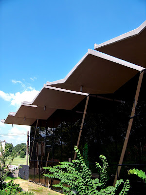
   This week we are looking at another golf course building in North Little Rock. This is the Greens at North Hills, but it is historically known as the Sylvan Hills Country Club. The Sylvan Hills Country Club was designed by local architect Raymond Branton, the same architect who designed Fire Station No. 6, and it was completed in 1963. This is actually the third building to stand on this site as the Country Club. The first was built by Justin Matthews in 1927, but it fell into disrepair and was eventually torn down. A second building was constructed in 1946, but it burned down in 1961. Undaunted, the community decided that third times the charm and they commissioned yet another to be built, which still stands today. Branton's design for the club house was a striking departure from the previous two, which had both been very traditionally styled buildings. Branton preferred to design in a Modern architectural mindset, as we saw in the Fire Station No. 6 discussion. However, in this building he decided to go a bit more High Modern.
Seagrams Building in New York City by Ludwig Mies van der Rohe (1958)

   Branton's design for the Country Club has many distinctly Modern features to it. The exterior is almost completely cover in a glass curtain wall, affording swiping views of the golf course. We also a very Mies-ian exposed structure which has been painted a flat black. This element echoes Mies van der Rohe's design for the Seagram's Building in New York City, and does so rather elegantly. However, it is the roof that is the really striking element to this design, and the element that sets it apart from most other Modern architecture.
   The accordion roof of the Country Club is an element that we see echoed in the work of Donald Wexler in Palm Springs, and an element that was commonly used in Googie Architecture, a subcategory of Modern architecture. (To read more on Googie architecture, please click the following link: http://en.wikipedia.org/wiki/Googie_architecture) Donald Wexler did several designs in the Modern architectural Mecca of Palm Springs, CA., many of which have become icons of the Mid-Century Modern movement. Some of these iconic houses featured accordion roofs similar to the one on the Sylvan Hill Country Club.
Donald Wexler's prefab steel house with accordion roof, Palm Springs, 1959-1962
These designs, due largely to their graphic nature, became more or less, the features that Wexler was known for in the architecture community. As such, they have also become the graphic symbols of the Mid-Century Modern period. However, Branton's design has far more in common with the highly acclaimed design by Sise & Desbarats for the Mount Royal Park Pavilion in Montreal, Canada. The Mount Royal Pavilion has a base that is raised, just like the Country Club, and it also has the glass curtain wall surrounding the structure. The scale is very similar as well, which is most likely due to the similarity of use between the two structures. However there is a feature that separates Branton's accordion roof design from that of almost all others, its reveals.
Mount Royal Park Pavilion by Hazen Sise and Guy Desbarats in Montreal, Canada (1961)

    These reveals we see in Branton's design is a really interesting design element on the structure. The fact that the placement of the reveals is at the peaks, and not the valleys of the roof, creates the appearance of a series of chevrons opposed to an accordion roof. Having the reveals in such a place would mean they are not present for water drainage, and thus not really a functional element. However, the effect created by the stripes of light that pours from between the openings serves to visually break up the long facade of glass. So not only does the reveals give the building a distinctive look, they also serve to create more visual interest on the facade. Another function served by the reveals is to draw your eyes outward towards the golf course when you are standing inside. So while this element is not functionally necessary for the structure, it is needed for the aesthetic aspects it brings to the building.
   As we have seen the former Sylvan Hills Country Club not only stands out in North Little Rock, its connection and similarities to other great pieces of Modern architecture causes it to stand in the full canon of Modern architecture. Its reveals set it apart from its contemporaries and shows an innovation of design only seen in Arkansas. However, it is yet another significant piece of the story of Modern architecture that is unknown to the majority of the world, but Arkansas can look at it and smile. It truly is a gem of architecture in the natural state.

Additional photos of the Country Club:
Roof reveal from the inside.
Entrance to the Country Club


For more information on the buildings or architects mentioned above, please check out the following links:

Seagrams Building:
http://en.wikipedia.org/wiki/Seagram_Building

Donald Wexler:
http://en.wikipedia.org/wiki/Donald_Wexler

Mount Royal Parc Pavilion:
http://www.lemontroyal.qc.ca/carte/en/html/Beaver-Lake--7.html


Monday, August 19, 2013

"Tee" Time


   As I mentioned in last week's post, North Little Rock did a great deal of public building in the late 1950's and 1960's. Fire Station No. 6, from last week, was one such project. This week we are going to looking at another project, the Burns Park Golf Center building. This building was designed by local architect Dan Stowers in 1964. The Golf Center Building is an interesting and very unique structure for the area. It contains the locker rooms for men and women as well as a lounge/eating area. The building is situated on one of the highest points on the golf course, which allows golfers a sweeping view of the course from the lounge room. However, it is the roof that is the truly striking and note-worthy feature of the structure.

An aerial view of the Golf Club taken from Google Maps showing the radial origins and the central oculus.

   The scalloped, radial roof of the Burns Park Golf Center Building is a feature that we don't really see in many buildings in the whole of the Modern architectural canon, much less on a building in Arkansas. Thin form concrete arches were not an uncommon feature in Modern architecture in America, especially in places like Palm Springs and Las Vegas, however the radial origin of the arches, which results in scallops, is very rare. There is a similar radial design in the Pan Am Terminal at JFK Airport, also known as Worldport, which was designed by Walther Prokosch of Tippet, Abbett, McCarthy Stratton. This similarity includes the oculus skylight at the center of the building. However, the Pan Am Terminal is not scalloped. If we look at the architecture of Mexican architect Felix Candela and his design for  Restaurante Los Manantiales in Mexico City (1958) or perhaps Eero Saarinen's design for the TWA Terminal at JFK Airport (1962), we see similar but more extreme versions of this scalloped roof design. However, the Golf Center Building is not as curvy as Candela's or Saarinen's work but more curvy than Pam Am's building. Really, this places the building half way between these design extremes. This creates a building with a fairly unique architectural position, not only in the state of Arkansas but in the full array of global architecture.

Structural Columns in front of the glass curtain wall of the lounge

     The roof is not the only Modern and not-worthy feature of this building. The structural load of the building is supported by a series of white concrete columns that surround the exterior wall of the building, and are attached to the ribs of the scalloped roof. This allows for an open design scheme in the floor plan as well as glass curtain walls in the lounge area. In theory, the building could be gutted and redesigned without compromising the structure, making a future remodel or adaption not only possible, but fairly easily done. However, these structural columns are somewhat unique in and of themselves. They are not the standard round or square columns that we typically find in public buildings. These have an almost Art Deco quality to them, with their modified Greek cross section. This makes these columns a unexpected surprise within the overall design of the building.
     The Burns Park Golf Center Building demonstrates that even a place with the rural reputation of Arkansas can have some surprising and innovative pieces of Modern architecture. It seems that in Arkansas, no place is off limits for stunning Modern buildings, whether it be on a remote river overlook, in the middle of a slum, or hiding within a 20,000 acre park.


For more information on the buildings mentioned above, please click on the following links.
Pan Am Terminal Building by Walther Prokosch.
http://en.wikipedia.org/wiki/Worldport_(Pan_Am)

Restaurante Los Manantiales by Felix Candela.
http://es.wikiarquitectura.com/index.php/Restaurante_Los_Manantiales


TWA Terminal by Eero Saarinen.
http://en.wikipedia.org/wiki/TWA_Flight_Center 

Monday, August 12, 2013

Fire Station Chic


    We are accustomed to seeing Modern architecture in places like down towns, college campus, or maybe even beside old major highways, but sometimes we find them in places that we least expect it. This is the case with this week's building. It is North Little Rock Fire Station No. 6. It sits at the intersection of Camp Robinson Road and Schaer Street in Levy, a small section of North Little Rock. Levy has never been a well-to-do area of North Little Rock. At its founding in 1892, Levy served mainly at a resting point for merchants going to Little Rock because they did not charge the high "over-night" fee that many Little Rock purveyors did. Levy was eventually annexed to North Little Rock in 1946. Levy had always been a blue collar area but when the construction of Interstate 40 cut it off from a great deal of North Little Rock, it took a turn for the worse. Levy is now an area of high crime and low employment. Things are starting to improve there but they are still not great. It is in this setting, in the shadow of the Interstate 40 overpass that we find this Modern beauty.
     The 1960's saw a great deal of building in North Little Rock. The established neighborhoods of Lakewood and Sherwood were significantly expanded and populations were steadily rising. It was during this time that many public service buildings were constructed. Fire Station No. 6 was among them. Fire Station No. 6 was designed by local architect Raymond Branton in 1964. Branton is also the architect for the former Sylvan Hills Country Clubhouse, now called the Greens at North Hills. While Branton's design for the fire station is not the high Mies-ian or Corbusier-ian Modern that we have been looking at, it is still unquestionably Modern and shows a great deal of innovation.
Structural Framework

     First lets look at the classically Modern elements of the design. Most notably we have the white concrete structure-work that frames the building. This idea of having the structure of the building exposed and apparent was one of the base principles of Modernism. We also have the flat roof of the Modern movement on this building as well as a complete lack of any unnecessary ornamentation. The entire composition of the exterior is all geometric massing, exposed structure, and floating planes. An interesting element here that we have seen in other Modern buildings, such as the Lee House No. 2 in New Canaan, CT, is the material massings. The center of the building is all glass on both front and back, almost like a glass box that was slid in between two masonry boxes. This creates a striking contrast between the middle and sides. The sides only have glass on the upper half of the eastern and western ends. This type of material massing is very similarly in the Lee House No. 2. It serves to separate the public from the private spaces, in this case the truck and equipment areas from the living quarters and offices.

Lee House No. 2 by John Black Lee in New Canaan, CT (1956)
     Now lets discuss the innovations and unique aspects of this building. First lets look at the material between the structural framework. We see that the infill between the framework columns and beams is concrete block. Now this may look like these concrete block walls are structural, but they are not. We know this because the joints between the blocks line up from top to bottom. This creates a lot of weakness in the walls, and should they have actually been supporting the structure, there would be significant cracking and breaking. The likely justification for the concrete blocks is for fire safety. It only makes sense to make a fire station fire proof. Another interesting and slightly innovative element to the fire station is the doors for the central bay. They are glass garage doors. These had only been used in one other building prior to this in the state. Dietrich Neyland used them in his design for the Arkansas Arts Center's first addition to provide lots of light and easy ventilation for the studio spaces. Branton is probably using them more for their stylish qualities rather than functional  here, but they complete the composition, so they are just as valid, and only marginally less innovative.
Glass Bay Door 
     The lesson that we should take away from Fire Station No. 6 is that Modern buildings can be anywhere and everywhere. They were functional as all types of buildings and where built in all sorts of areas. While the light of Levy's glory may be very dim, this Modern masterpiece shines bright all on its own.


For more information on the Lee House No.2, please refer to the following link:
http://www.preservationnation.org/travel-and-sites/sites/northeast-region/new-canaan-ct/sites/lee-house-2.html

Friday, August 2, 2013

"She's a Brick House"


     This week we return to our more Modern buildings. Here is the former ACME Brick showroom building on Victory St in Little Rock, AR. This building is really a step beyond the International Style movement that we have been discussing. It contains many elements found in the International Style, but there are a few ornamental touches that would have been somewhat sacrilege in the International Style movement. However, we will discuss the architectural elements of the building in a moment. First let me tell you a bit more about the building's history. The ACME Building was designed by the firm of Eherhart, Eichenbaum, & Rauch and was constructed in 1958. Eherhart, Eichenbaum, & Rauch is the firm that is responsible for buildings such as Beaux-Arts Parnell Hall at Arkansas School for the Deaf (1931), the Art Moderne styled Arkansas State Tuberculosis Sanitarium in Booneville (1938), and the original International Style St. Vincent's Hospital (1958) at the corner of University and Markham in Little Rock.The ACME Building was designed to serve as the showroom for the various products that ACME Brick had to offer. To this end, the firm designed the building in such a way that the exterior became as much a showroom as the interior was.  We see the dark, almost black brick on the majority of the facade. The inset on the West facade is accented by yellow and golden bricks with concrete textile blocks creating sun screens in front of the windows. The floating steps are even made of bricks which were set into a cantilevered metal frame. When looking at the building with this mindset, it fully exemplifies the Modern architectural concept of the function or purpose of a building being evident on its exterior. ACME stayed in the building until 1996 when they sold it to the state for offices. Various different agencies have been housed in the building since then, most recently the Arkansas Asphalt Pavement Association. However, there will never be a more appropriate inhabitant than ACME Brick. Now, let us discuss the architecture of the building, from top to bottom.
     Starting with the roof of the ACME building, we find our first significant feature. While it may appear as your standard floating, flat roof, the same sort of roof seen in hundreds of other Modern buildings, it is in the construction of it where we find its significance. It was created use of what is called a "lift slab" system. This is done when the roof plane is poured on the ground and then lifted up by means of hydraulic jacks to rest upon the structural columns which are installed after it is lifted. To my knowledge, this was the first building in the state to have this construction system implemented on it.

    Next, let us move from the roof to the body of the building. Other than the beautiful, if not a touch gaudy, metallic gold bricks, the most noticeable feature on the building's main facade is the concrete textile block screens that adorn it. This elements, which constitute a departure from the strict ornamental minimalism of International Style, serve a function beyond just aesthetics. These screens not only provide a bit of privacy to the offices beyond the windows which sit behind the screens, but they also provide a bit of shade without completely blocking the light. Similar design elements were used in the highly popularized Palm Springs Modern houses of A. Quincey Jones, Palmer & Krisel, and George & Robert Alexander. We also see this architectural feature locally in Arkansas. Architect Dietrich Neyland of Ginocchi, Cromwell, & Associates used a very similar concept in his designs for Reynolds Elementary in Morrilton (1956), UALR Commons (1956), and two buildings at Philanders Smith College in Little Rock (1957). The internationally renowned Arkansas architect Edward D. Stone was also known for commonly using a concrete textile block screen. Some notable examples of this from him are his designs for Carlson Terrace Apartments (1957) and the Sigma Nu Fraternity House (1953), both at the University of Arkansas at Fayetteville. The likelihood that the designers at Eherhart, Eichenbaum, & Rauch were familiar with these building is pretty high, but no direct connections can really be made on influence. However, it is a functional as well as beautiful element to include on any Modern building, and it certainly does help this one to stand out a bit more.
UALR Commons by Dietrich Neyland (1956)

Carlson Terrace Apartments by Edward D. Stone (1957)

     Finally, we come to the base, or more specifically, the stairs. This is actually my favorite element on the entire building. They were designed by a young Gene Levy who was interning with Eherhart, Eichenbaum, & Rauch while he was in school. Mr. Levy went on to work directly under Dietrich Neyland at Cromwell, and later to become a partner at Cromwell, but I digress. While Mr. Levy describes the stairs a series of geese looking over one another, I think there is a more famous source of inspiration for these stairs. A similar set of floating stairs were designed by Ludwig Mies van der Rohe for his Farnsworth House (1951). Young Mr. Levy, being a good architecture student, would have known of this elegant staircase. Now whether Mr. Levy was conscious of this influence is unknowable, but the staircase that came out of young Mr. Levy's mind is a source of joy for me every time I drive by and see them.
Gene Levy's design for the ACME Building staircase
Ludwig Mies van der Rohe's staircase at Farnsworth House (1951)
   As we have seen, though this building may have intended to be just a simple showcase, the resulting composition is one of lasting interest and significance.


A detail shot of the golden brick and concrete textile block screen